
Wednesday, March 24, 2010

Candice Low Self Portrait
A big part of my life revolves around rhythm--feeling, creating, expressing it in all that I do, be it dance footwork or piano footwork or the rhythmic stirring of a pot of stew. I decided to depict my feet in my self-portrait cos its my primary way of sensing rhythm. Besides, our poor feet obligingly run us around all day and we hardly examine them as much as we do our faces. In dance and music, one of the most important concepts is knowing how to feel your weight into the ground, and then learning how to transfer or shift that weight through other channels in your body. I tried to convey this sense of rhythm through the lines in my drawings, and then did some smudging and shading that didn't really show up on the camera. Conveying rhythm in music and dance is also about conveying a sense of direction, which I guess is a concept that could easily apply to real life--a little bit of rhythm never hurt anybody


7. Dan Cary, Josh Moses, Scout LaRue
It's too bad that youtube is such bad quality. Our film is about Thursday mornings after Fish CO
The Scilight Zone : Olivia, Michael and Katie's stop motion animation
OK so I've been trying to load this thing for an hour (no jokes) so here is the youtube thing.
http://www.youtube.com/results?search_query=scilight+zone&search_type=&aq=f
http://www.youtube.com/results?search_query=scilight+zone&search_type=&aq=f
Katie Sola Self Portrait
For this project, I decided to hold a camera to my head, right at eye level, and film myself going about my daily business. The idea was to invert the traditional self portrait dynamic of looking into a person from the outside. I figured that this method would actually provide a far more accurate view into the experience of being myself than an artistic construct.
The results are attached. It shows me coming out of the SciLi, walking back to my room in home sweet Keeney and then eating some berries and reading Vanity Fair. I would have liked to do it in a continuous shot but the silly memory card would only do a few minutes of video at a time, hence the jumpiness. It's excruciatingly boring. I had meant for it to be longer, but after reviewing the footage I realised I didn't want to inflict any more of this on you.
However, the video does reveal something interesting about self-portraiture. This video is a 100% accurate depiction of myself, I didn't edit it, add music or stage anything. It shows exactly what I see, the angle of my head and the rhythm of my steps. However, it totally fails to communicate anything about who I am.
This goes back to the question of "what is art?" Some people say art represents life. I learned from this project that art which absolutely imitates life is not art at all. Paradoxically, the unrealistic construct of an oil painting portrays the reality of a person far more effectively than a straight-up duplication of their life.
The results are attached. It shows me coming out of the SciLi, walking back to my room in home sweet Keeney and then eating some berries and reading Vanity Fair. I would have liked to do it in a continuous shot but the silly memory card would only do a few minutes of video at a time, hence the jumpiness. It's excruciatingly boring. I had meant for it to be longer, but after reviewing the footage I realised I didn't want to inflict any more of this on you.
However, the video does reveal something interesting about self-portraiture. This video is a 100% accurate depiction of myself, I didn't edit it, add music or stage anything. It shows exactly what I see, the angle of my head and the rhythm of my steps. However, it totally fails to communicate anything about who I am.
This goes back to the question of "what is art?" Some people say art represents life. I learned from this project that art which absolutely imitates life is not art at all. Paradoxically, the unrealistic construct of an oil painting portrays the reality of a person far more effectively than a straight-up duplication of their life.
Chris, Allison, Lucy S, and Lucy BC- Stop Motion - Peeps are People, too!
I think that is just about self explanatory.
Allison Barker- Self

So yea... this is me... sort of. It actually looks more like my mom, but I kind of look like my mom. Anyway, this is my first official dabble in watercolors.
Tuesday, March 23, 2010
8. Rachel Borders: My Self.

So this may seem a little weird to people, but when thinking about they project I realized that its really the people I have met and grown up with that have really made me who I am (and a little bit of craziness). I collected facial features of myself, my family, my friends, and people that have had an impact on my life and brought them together to create one face. Then I added some craziness to represent the parts that are distinctly me. It may not look like me on the outside, but it sure is me on the inside.
Rachel Borders, Candice Low, Daniel Ton - Balloon Date (Stop Motion)
P.S. I made a youtube account username:springfoundations and the same password as for the blog if you want to use it to upload your videos.
Saturday, March 20, 2010

Thursday, March 18, 2010
Jeanine - a poor excuse for the late posting?
While I was forgetting to post my banner on this site, I was, in my defense, doing something artistic >_>. Brown Gendo Taiko (which had its performance last weekend!) builds and repairs their own drums, and this semesters, we made two small chudaikos.
 One side of the drum, skinned, stretched and tacked! The body is made out of a wine cask, with the holes filled and bonded, sanded, then finished. The metal carrying handles (kan) were designed, made and cut by Miles Endo, a team member and Industrial Design student at RISD. The drumheads are made out of cowhide.
 The other drum, with its skin being stretched with rope, later to be tightened with sticks (bachi).
 One side of the drum, skinned, stretched and tacked! The body is made out of a wine cask, with the holes filled and bonded, sanded, then finished. The metal carrying handles (kan) were designed, made and cut by Miles Endo, a team member and Industrial Design student at RISD. The drumheads are made out of cowhide.
 The other drum, with its skin being stretched with rope, later to be tightened with sticks (bachi).
Jeanine - Emulation


This is my emulation of El Greco... I took a couple liberties (okay maybe more than couple) due to the sheer complexity of this piece. In conclusion: master painter I am not. (but yoda I am)
Jeanine - Banner

I completely forgot to post this though I completed it last week! Anyways, yes, class blog banner.
Leah Cogan - Header...much delayed

My header. Not remarkably original. Has springs in it! Tries to focus the eye using linear direction. Hope you like it!
Tuesday, March 16, 2010
8 - Jonah Kagan: Pelf Sortrait
What do you call a wildcat with ADD?
Hyperlynx!
Anyway, here's the lynx:
http://sites.google.com/site/jonahkagan/selfportrait
Don't be shy now...
Hyperlynx!
Anyway, here's the lynx:
http://sites.google.com/site/jonahkagan/selfportrait
Don't be shy now...
not stop motion but ....
I found this on the webbb and its amazingggggggg
http://www.mymodernmet.com/profiles/blogs/hyperrealistic-acrylic-body
http://www.mymodernmet.com/profiles/blogs/hyperrealistic-acrylic-body
Monday, March 15, 2010
Daniel Ton - Notte Sento
My favorite stop-motion, Notte Sento:
Edit: it's cut off on the right side, better just watch it on youtube: http://www.youtube.com/watch?v=NsAhqEDFhb4
Leah Cogan - Actual stop motion! - Tony vs. Paul
Wait! Check this one out! I love stop motions with real human bodies. You can transcend all physical boundaries with stopmotion, assuming you don't have the Matrix technology available to you! This is a pretty epic battle!
http://www.youtube.com/watch?v=AJzU3NjDikY
P.S. Technology + me = epic battle, hence why I can't seem to upload the videos I want. I'm sorry!
Leah Cogan - ...not stop motion...but cool!
So "Her Morning Elegance" is definitely my favorite stop motion video I've seen (I haven't seen many). But Allison was quick to snatch that one! But while questing to find another, I found this sand art video which is mind-blowingly beautiful! Check it out!
http://www.youtube.com/watch#!v=XFloPzc95-s&feature=related
http://www.youtube.com/watch#!v=XFloPzc95-s&feature=related
Friday, March 12, 2010
Allison - Stop Motion
So this is by far my favorite stop motion:
And these are some recently ones I discovered:
ohhh and there's also some really cool ones by PES
And these are some recently ones I discovered:
ohhh and there's also some really cool ones by PES
Thursday, March 11, 2010
Josh Moses- Header?

Ok, I know its not really a header but I was thinking about what this class particularly makes me think about when I was sketching in the library late at night and I realized that this class makes me think about doing just that. So, I quickly gathered my resources used my kneaded eraser to sculpt some of the letters and boom, here we are.

Wednesday, March 10, 2010
07. Megan Estes. Header.
 This is what a silly header on a limited time budget looks like. Hurrah!
Megan

6.- Dan Cary- Header


I went with something a bit grungier. But really I like Elsa's alot better than these.

7-Elsa Obus-Header!

Lucy Schultz's Header

I tried to make the header to incorporate some of the projects we have already done, but I still wanted to keep it simple.
Katie Sola Header

So I know this looks nothing like "Spring Foundations 2010". However, that's exactly what it says. I used one of those wacky fonts that are actually a kind of modern hieroglyphic system, like Wingdings. This particular font is called, appropriately, "Zapf Dingbats".
I quite like it because the meaning is visually encoded in there but hidden from the viewer. You need to know the visual language to figure out what the writer is trying to say. Which is a lot like what we're trying to do in this course.
Also, the symbols happen to allude to our course. There are the cubes and squares which make us of perspective, and the pencils and pen nibs.

Olivia Fagon: Heading

I chose to incorporate more images into my heading. Because this is an introduction course, i decided to visualize our growth and development throughout the course. In the heading the hand begins by drawing a simple gestural figure, which transitions to a more complicated sketch, to a famous drawing by Picasso, to an even more well known drawing by DaVinci. I think it translates the overall aim of the course, as we gain techincal skill, and knowledge of art history, but hopefully maintain our own personal artistic eye.
6. Rachel Borders: Heading.
My heading.
I used to cut up magazines a lot as a kid. So I thought I would make a preteen blog header.
Leah Cogan - 3

 I'm very late with this but I've finally scanned my rendition of Nicoletta Ceccoli's 'Tower'. What I found most intriguing about this image is the geometrical perspective which, at the time, we were looking at in class (drawing all our neat little cubes!). The contrast of light and dark proved very difficult when only using a black and white palette. Perhaps the project would have been easier now! I was attracted originally to children's illustration and found myself drawn to the active but flat slivers of story given to us by the Caldecotts and Beatrix Potters of early child books; the simplicity of the defined line and soft watercolors, in a rather Toulouse Lautrec style (with whom I have always been obsessed). Relationship was important to me. These images convey story. But I also felt it necessary to play with dimension. Ceccoli's illustrations have an incredible depth and roundness, something I wanted to play with and see if I could accomplish. Illustrations these days resort to this deep, dimensional, almost computerized feel, often using clay models first or digital refinements. For example Shaun Tan's work (check him out!) What Ceccoli maintains is this kind of 'Precious Moments' heightened proportions of the child to really tug at the sympathy of the viewer. Check more of her stuff out.
Tuesday, March 9, 2010
7 - Jonah Kagan: Headurr

I just wanted to do something simple and graphic that would pop on the screen - so here it is.
Thursday, March 4, 2010

70 Million by Hold Your Horses
Hello class,
Here's a spectacular music video where the artists recreate a bunch of famous paintings (like that one Arrested Development episode). Check it out and see how many you know!
- Daniel Ton
Sunday, February 28, 2010
fooooood
So I [unwittingly] drove into the heart of the storm Friday to visit the Culinary Institute of America (and my best friend...I'm not that dedicated to food). There, I stumbled upon a couple of dueling snowmen at Vassar...

Oh, and the food was amazing of course - specifically the fries with black truffle salt (yum!)
And then this morning, I visited The Duck and the Bunny - a snuggery. They must have taken some notes from our class since I found a few emulations:


Oh, and the food was amazing of course - specifically the fries with black truffle salt (yum!)
And then this morning, I visited The Duck and the Bunny - a snuggery. They must have taken some notes from our class since I found a few emulations:


If you like scones and finger sandwiches with your tea time, you should definitely take a visit! It's on Wickenden street. I miss the Blue Elephant though :(
Thursday, February 25, 2010
Michael Yanagisawa - Imitation
For my copy I did Picasso's "Bullfight." We went to the Guggenheim in high school, and this picture has since became my favorite. I tried to copy faithfully, but it was surprisingly very difficult, so the result is a fairly-close copy. The pencil was too light to show up on a picture, but here's the original:
I was thinking about coloring mine in too.
Olivia Fagon

I'm unable to load my imitation but I chose Goya's Saturn Devouring Child. This is one of my favorite painting, but it was extremely difficult to reproduce. The application of the paint was so gestural that recreating it with a pencil proved difficult. I tried however. I am not a fan of art reproductions, but I understand the value of trying to recreate an artist's piece of work. But that would exercise would have much more to with the process rather than the final product, which is just a copy. Goya's piece speaks to Benjamin's idea of aura, a quality original art has from the immediacy it's given through the context that its created in. It would be almost impossible to truly recreate Goya's Saturn because so much it stems from unstable mental state, which we see translated through color choice, and rough grotesque gestures with the paint brush. There is a uniqueness, an 'authenticity' as Benjamin describes that can not be reproduced.
5-Elsa Obus-Translation, Imitation, Emulation
I copied The Toilet of Venus by Diego Velazquez. My favorite part about the original painting is the curves of Venus' body. I think they're so human and soft.
In my reproduction, after numerous (failed!) attempts at drawing human faces, which frankly I am not so good at but will work on, I decided to focus more on the movement of the background and leave the figures as pale shells. I think this actually still ended up accentuating the curves of the human form. I know it looks pretty different but I think it's interesting.


06. Megan Estes. Imitation.
I don't actually know the name of this piece. It is a photograph I found in Black and White magazine.


I tried to render this pretty closely, mostly because I don't know what something looks like unless I'm staring at it. It's not exact, but I like how it turned out.
Wednesday, February 24, 2010
04 - Chris Tyler: SIMULACRUM (?)

In copying this 1806 Ingres painting, entitled La Grande Baigneuese, I initially found myself distractedly absorbing the work of art (rather than being absorbed by it). The entire act of copying the work with the help of the grid felt particularly mechanical, and, ultimately, quite unfulfilling. However, as soon as my figure began to take shape (and I consequently became increasingly less frustrated by my inability to render the figure to scale), I found myself being absorbed by the work itself. I became enthralled by Ingres' delicate, velvety rendering of the bather's skin, and as I focused on shadowing her person, my mimetic task quickly became a fulfilling one.
It's not an exact replica, for I really only focused on the figure herself (a figure that Ingres, interestingly enough, seems to have been particularly obsessed with throughout his career). Indeed, Ingres returned to the form of this figure several times throughout his life...and so I wonder what aural quality my own duplica-of-sorts takes on in its subconscious illumination of the original artist's fascination.
Carel Weight imitation


This is a great painting by Carel Weight called "The Witches are Here". He exactly captures the London architecture and light, something I have spectacularly failed to do.
Lucy Schultz- Imitation

I did an imitation of this Diane Arbus's photograph. But I can't get my drawings to load on the blog for some reason, so I'll just have to show them in class.
Candice Low copycat
 This is a print called "Dancers Resting" by Raphael Soyer, and that is my attempt.
5. Daniel Ton - Imitation
I copied Gustav Klimt's Beethoven Frieze (1902). To compensate for the monochromatism I outlined the focal subjects in marker. I also applied a metallic Sharpie sparingly, since Klimt's use of gold is one of the reasons why I like him so much. Sadly, the marker is old and dying, so it's not as metallic as I hoped.


6 - Jonah Kagan: I'm it, @ ion
So back in the 60s when I used to drop acid all the time, I used to love to stare at words and watch them twist and melt and bleed together. After I cleaned up my act, I found a certain comfort in the work of Wes Wilson. So naturally I picked this concert poster of his to copy:

Reading Benjamin's essay made me consider the place of artwork like Wilson's. Copying it gave me a sense of just how much effort and precision actually goes into a piece like this. But its purpose is to announce a concert - it is a medium designed to convey information to the viewer. However, this particular concert came and went, yet the poster is what people remembered. Even though this poster was mechanically reproduced at the time, it is now considered a more pure form of art. Is it just time that separates the two? Why aren't we grabbing posters off building walls and keeping them for ourselves? Surely someday some misguided student will think its a good idea to try to copy one of them...
Anyway, here's my dose of psychedelic for the day:

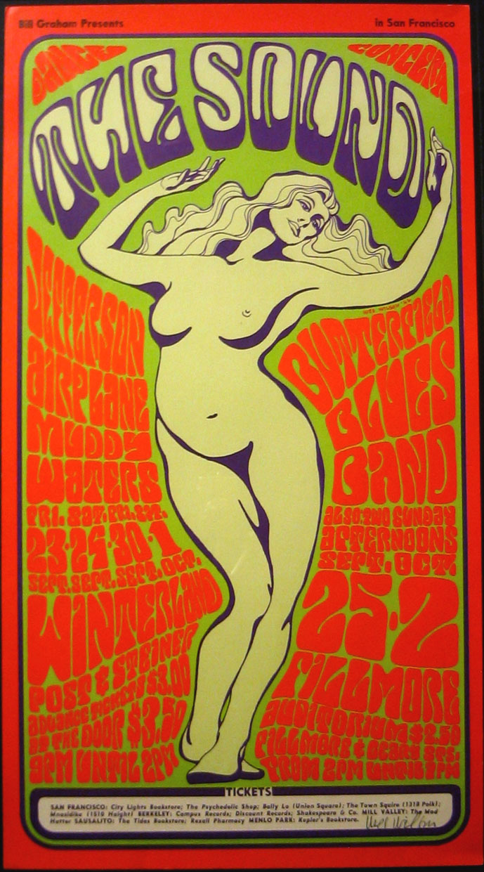
Reading Benjamin's essay made me consider the place of artwork like Wilson's. Copying it gave me a sense of just how much effort and precision actually goes into a piece like this. But its purpose is to announce a concert - it is a medium designed to convey information to the viewer. However, this particular concert came and went, yet the poster is what people remembered. Even though this poster was mechanically reproduced at the time, it is now considered a more pure form of art. Is it just time that separates the two? Why aren't we grabbing posters off building walls and keeping them for ourselves? Surely someday some misguided student will think its a good idea to try to copy one of them...
Anyway, here's my dose of psychedelic for the day:

5. Dan Cary- Imitation
For my Emulations, I found two pics I liked. The first was a really simple logo of a pitbull's face for an animal shelter. It was built entirely from the shadows which I thought was pretty cool but I wanted to give it more substance so I drew what I thought the face should look like and added a body as well. For the next one, I was studying in the sci li and needed to take a break so I picked up a magazine that someone had left behind and saw this ad for Grand Theft Auto. I picked a single one of the characters rather than the whole scene and tried to be pretty true to it.

For my
 For the next one, I was studying in the sci li and needed to take a break so I picked up a magazine that someone had left behind and saw this ad for Grand Theft Auto. I picked a single one of the characters rather than the whole scene and tried to be pretty true to it.
For my
Subscribe to:
Posts (Atom)